Your first step should be consideration of your
client's objectives to determine what kinds of
photos will work best. A successful design must
support your client's marketing goals.
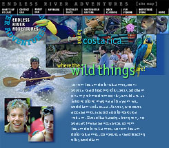
While creating a special page about ERA's Costa Rica
kayaking trips to illustrate this article, I kept in
mind that my clients, Ken and Juliet Kastorff,
always want whitewater shots included because they
appeal to paddlers who go on trips to Central
America to extend the paddling season from summer
into the winter.
I can also use 'postcard' shots to interest people
in combining kayaking (or mountain biking) with
foreign tourism. And, since women can excel as
easily in kayaking as men, Juliet and I like to use
photos of female paddlers whenever possible.
The next step is choosing photos. If you have lots
of pictures from which to choose, the possibilities
may feel overwhelming. Don't worry - you can refine
your selection later while you work on your page
layout and find that some work better than others.
I began work on my new Costa Rica page by looking
through several CD-ROMs for suitable photos. I
copied more photos than I would actually use, then
saved them to my computer.
Next, I studied the composition, quality, and colors
in the photos, trying to predict which would work
best. Special attention went to noting areas of
bright or neutral colors common to several
photographs.
Though I don't actually mark up my photos, I've
marked a few here to help you visualize my process.
Yellow circles highlight spots of bright color that
may serve nicely as accents in my color scheme.
By the time I completed this step, I already
anticipated using a color scheme composed of cool
turquoise blue and green since these colors are
shared by some of my favorite photos. Others had
areas of gold, yellow or red which would spice up
the cool turquoise palette.
Finally, I discarded some photos and sorted my 'keepers'
into folders organized by topic and/or accent colors,
such as 'Costa Rica kayaks yellow' or 'CR birds
animals red.'
Since I have already established a 'look' for ERA's
pages, I don't bother with sketching layout ideas on
paper. Instead, I design directly in Photoshop.
Before plunging directly into design work, let's
talk about how to design a color palette derived
from only one or two photos. Practice with these
less overwhelming tasks will prepare you for more
complex design projects.
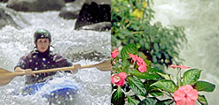
For the illustration shown at the left, I chose one
photo, then added a layer for use as a 'scratch pad'
for playing with colors.
Using the eyedropper tool to sample colors from the
photo, I painted little swatches of color on my
scratch layer. Suspecting I might need more
contrasty versions of these colors, I darkened,
lightened and/or added saturation to selected areas
of the swathes.
Below the photo, I added blocks of blue and
off-white chosen from the swatches on my scratch pad
to test their effectiveness as background colors for
my HTML page or for tables.
Next, I set text samples with Photoshop's text tool,
with anti-aliasing turned off, testing to find
successful combinations of colors. I used my color
swatches as sources for the text colors, adding
white for additional contrast as needed.
If I were going to complete this design, my last
step would be to open the file in ImageReady (or
Fireworks), slice and optimize. I would also make
note of the hex values of the text, background and
link colors that I would need to specify colors in
my HTML code.
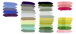
When you use more than one photo, try making color
swatches as before, except this time when a color is
unique to only one image, place it on the outer edge
of the scratch pad.
When similar colors appear in both images, place
swatches in side-by-side columns. You may also want
to create lighter, darker and more saturated color
variations.
When colors in the two middle columns are very
similar, it's safe to base your color palette on
these colors. Both color schemes shown below the
photos at left work well because their light green
backgrounds - chosen from the water in the
background of each photo - serve to unify the
otherwise unrelated photos. Those colors that appear
in only one photo should be used more sparingly,
such as for 'hover' or 'alink' colors.
If you can't find enough similar colors among your
photos, place a semi-transparent layer containing a
copy of one column of swatches on top of the other
column. This will result in a third set of colors
that coordinate nicely with both photos.
When you advance to creating a color scheme for a
page with lots of photographs, you'll find it
surprisingly easy.
Since for demonstration purposes I've used more
photos on my Costa Rica page than usual, arranging
them was actually harder than choosing the color
scheme.
For this project, after filling the base layer of my
Photoshop file with the blue background color, I
added a new layer for each image, beginning with the
kayaker photo in the background.
Layer masks were used to silhouette and crop photos,
and to create translucency as needed to reveal a
tint of blue from the background. A layer of scan
lines added more blue, continuing a theme used
throughout ERA's site and making the images less
appealing to thieves. Scan lines were masked as
needed to reveal more of each photo. Areas of some
photos were colorized to force them to harmonize
with my color scheme.
While I created a few color swatches on a scratch
layer, I often shortcut the process by visually
scanning for common colors, then sampling them
directly from photos. Then, to give the type
graphics more contrast, I substituted brighter, more
saturated versions of those colors from Photoshop's
color palette.
That's all there is to it. Now I'm ready to slice 'n'
dice!
But first, I'll mention another benefit of using
these techniques — experimentation is easy and often
results in creative new color combinations.
I'm just like a kid with a new jumbo box of Crayolas
when I play with color schemes. I hope you'll enjoy
these techniques as much as I do!
In the early days of Photoshop when 8-bit monitors
were the norm and every file had to have a palette,
there was a filter that manipulated the palette to
give 'colour cycling'. Each one of the 256 colours
values in the palette gradually changed and the
overall effect was one of an ever-changing colour
scheme that swept through a multitude of
mind-blowing, psychedelic images. When you saw one
that you really liked, a press of the space bar
froze it so that it could be saved.
Modern computers with 24 or 32-bit displays don't
use palettes in this way and the filter, whose name
I can't remember, is long gone, yet the ability to
see a wide variety of 'colourways' of a particular
Web page design is very useful and can produce
amazing and unpredictable results that unlikely to
be arrived at by design – they are happy accidents,
'happenstance'!
All is not lost.
In Photoshop's armoury of 'Adjustments' in the 'Image'
menu is something called 'Hue/Saturation' which does
much the same thing. It cycles the colours (hue) in
the image as you drag the slider left and right. It
also allows you to change the strength (saturation)
of the colours and make them lighter or darker (lightness).
The filter only affects the currently selected layer
but for most purposes, the original design is best
screen-grabbed from your browser and opened in
Photoshop as a single layer. Moving the hue slider
will show you what the design would look like in
hundreds of different colourways. You can also boost
or flatten the purity of the colours with the
saturation control and lighten or darken the effect
for more drama or subtlety.
There is also a button called 'Colorize' which
switches the whole process into a monochrome mode
giving more subtle, harmonious colour schemes.
It is very much a matter of trial and error. Many of
the colour schemes produced like this will be lurid
and horrible – but amongst them, there will be a few
gems. You just have to spot them!